Year
2025
Project type
Feature design / Mobile platform
Role
Lead Designer (co-led)
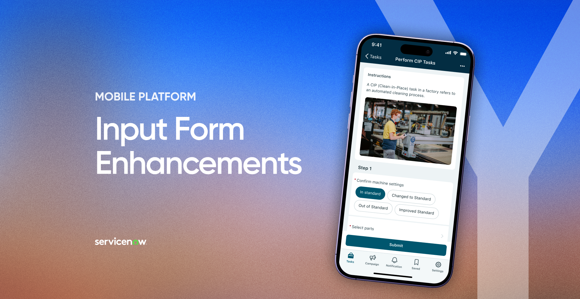
A large-scale redesign and enhancement of the mobile input form screen at ServiceNow - modernizing the UI, introducing new input types and inline actions, and creating a scalable foundation for multiple BU agent personas. Led as part of a cross-functional team of 2 designers, multiple PMs, and engineering & QA teams, across iOS and Android native mobile.
The existing input form screen had accumulated significant UX debt:
- Users were forced into repetitive back-and-forth navigation to complete a single form, creating disorientation and unnecessary taps.
- The layout was outdated and non-scalable - unable to accommodate new enhancements such as input actions (comments, attachments) and descriptive elements.
- The form was lacking input types and capacilities to improve UX.
- Tablet layouts were entirely underutilized.
At the same time, ServiceNow's acquisition of 4Industry, a Netherlands-based platform for Industrial Connected Workers in manufacturing, introduced a new persona with distinct needs: the Operator. Operators work in demanding physical environments (helmets, dirty hands, loud surroundings), often with limited connectivity, and rely heavily on clear, guided, low-friction interfaces. Bringing 4Industry's customers onto the ServiceNow platform required feature parity - and this was the opportunity to do it right.
Design a proof of concept that makes recycling genuinely fun and habit-forming for kids and teenagers:
Our approach as a platform is to think broadly and adapt specific requirements to fit multiple use cases, therefore, our vision was to leverage the opportunity from the acquisition to tackle pain points from our backlog and enhance the user experience. Our ultimate goal was to create a generic solution that can be customized for different agent personas - FSM field technicians, ICW operators, Healthcare workers, Retail employees and more, enabling them to complete their work more efficiently.
Our design goals:
Make the invisible impact of recycling visible and personal through AR
Drive repeat behavior with proven game mechanics — collection, rarity, quests, a shared world
Build a visual identity and UI that reads as a premium game, not an educational tool
Ship a fully functional demo that real users could pick up and play at the exhibition
Research ran on three tracks: competitive landscape, target audience, and technical feasibility.
Competitive landscape: Recycling utilities solve information, not motivation. AR eco campaigns create a moment of awareness, then end. AR games (Pokémon Go, Pikmin Bloom, Peridot) sustain habit-forming loops — but ask nothing of the real world. Every product had play or real-world action; none had both. That was the unclaimed middle.
Audience: The primary persona isn’t the eco-motivated kid — it’s the indifferent one. Daniel, a primary school student who plays phone games daily, has heard of the climate crisis but it feels distant. He won’t download an app about recycling — he’ll download a game his friends play outdoors. Hook through play and collection, and let environmental awareness arrive as a byproduct.
Technical feasibility: The unlock came from a design meetup where Shay Segal, Head of XR at Resight, presented spatial persistence technology — AR objects that hold their real-world position over time and stay synchronized across all users. This was the missing piece that made a shared creature world possible. Resight joined as a technology partner, and their engine powered creature placement and persistence in the POC.
“The upcoming mobile platform innovations will go a long way toward helping Brightspeed technicians. In particular, enabling inline editing and Improving the UX of inline choice lists literally solved over half of their most critical issues.”
The real question wasn’t “how do we gamify recycling” — it was “what reward actually changes behavior long-term?” Points and badges fade; they’re abstractions. A living creature that exists in the real world, at the exact spot where you recycled, creates a persistent emotional bond — your mark is literally placed on the world. Every creature carries its story: a randomly generated name, who freed it, where, and when.
The “trash traps creatures” narrative reframes recycling from chore to liberation. The system behind it: an Ekodex of 51 collectible creatures organized by bin type, with 50 color variations across the 3D creature set — a deep collection meta-game built on top of one simple action.
Rather than designing for a specific persona, we shifted control to the admin layer while considering the needs to multiple personas. Every new feature - descriptive elements, inline actions, section grouping, slider input - was designed to be fully configurable. Admins can decide what appears, in what order, and how it behaves, allowing the same screen to feel tailored for a factory operator completing a guided task or a field technician resolving an incident.
Persistence is the emotional core of the product — but if every creature lives forever, the shared AR world fills with clutter and the magic dies. This was the central systems-design tension.
The resolution: decouple world presence from ownership. Each freed creature receives a random rarity — Normal lives in the world for 2 days, Rare for 5, Unique for 10 — then it leaves its physical spot but remains in the player’s collection permanently. The shared world stays dynamic and fresh; the player never loses what they’ve earned. One mechanic, three jobs: clutter control, scarcity-driven excitement, and permanent ownership.
The research phase closed on a hard question: with a young audience, should the game require actual recycling — or just simulate the experience and teach habits through play? The answer was a product principle: the real-world action is the product. A game that rewards recycling without recycling is just another screen.
That principle had to be enforced by design, not trust. After scanning an item, the navigation map shows only the correct bin type for that material, and the Recycle button stays disabled until the player is physically within range of a bin. Small interaction decisions, doing the integrity work of the entire system.
In an AR product, the real world is the canvas and the creatures are the content. The UI’s job is to get out of the way. Drawing on Japanese design principles and minimalist aesthetics from successful AR games, the interface is deliberately clean and unobtrusive — zero visual competition with the AR layer.
The brand carries the concept too: the logo merges the letters “E” and “k” into a single continuous line that reads as a butterfly — cycle, nature, transformation — the mark you leave on the world, compressed into one symbol.
True AI trash recognition was out of reach for a 3-month POC — and betting a live, public demo on an unproven ML model would have been a gamble with the entire project. The pragmatic move: marker-based recognition — color-coded stickers in the design spec, implemented as unique QR codes on each trash item in the live build — so scanning worked reliably, every single time, for every visitor. This is a classic POC tradeoff: simulate the hardest technical component to validate the part that actually needed proving — the experience. The intended ML approach was documented for the production path.
Three months, one designer, one developer, a hard public deadline. The full product surface was designed — Store, Settings, bin navigation with distance tracking, bulk recycling via the Bag, educational content, procedural creature naming — and then deliberately cut from the build, with each cut negotiated against development effort. Everything shipped served one loop: find trash → scan → recycle → receive creature → see it live in AR. If a feature didn’t prove that loop, it stayed in Figma. That discipline is why the exhibition demo was polished and functional rather than broad and broken.
The creatures are the product, so outsourcing them wasn’t an option. Blender was learned from scratch for this project — alongside AI tools adopted to keep the workflow efficient — and every creature was modeled and animated in-house. Each design derives from its trash item’s shape and material — a conceptual logic that makes the collection itself reinforce the recycling message. The creature is the trash, transformed.

Core loop (shipped in POC): Home Screen (AR) → Scan Item → Item Recognized popup (material info, biodegradation time, EkoCoins + XP reward, eco fact) → Navigation map filtered to the correct bin type → Proximity-gated recycle confirmation → Creature reward card (name, rarity, lifetime, location found) → Creature placed in the shared AR world
Secondary flows (fully designed, partial POC):
Two videos produced for the exhibition — a promo video showing the concept and emotional hook, and an app overview walking through the full UX. Both are embedded below.
A live, fully functional AR POC ran for the full exhibition — Minshar College of Art, Tel Aviv, July 19 – August 5, 2023. Visitors downloaded the app, scanned QR-coded trash items planted in the gallery, recycled them, and received their own creatures. The shared world worked in public — every visitor walked into a gallery already populated with creatures freed by the visitors before them, and left their own behind. The core concept, validated live. Featured in Lenslist, a leading AR industry publication, in a dedicated interview on AR’s potential for real-world environmental impact. Exhibited alongside 3D-printed creature models and two showcase videos. The project’s larger point: design isn’t confined to screens. Paired with emerging technology, it can shape behavior in the physical world — and Ekolect was built as proof.
The existing input form screen had accumulated significant UX debt:
- Users were forced into repetitive back-and-forth navigation to complete a single form, creating disorientation and unnecessary taps.
- The layout was outdated and non-scalable - unable to accommodate new enhancements such as input actions (comments, attachments) and descriptive elements.
- The form was lacking input types and capacilities to improve UX.
- Tablet layouts were entirely underutilized.
At the same time, ServiceNow's acquisition of 4Industry, a Netherlands-based platform for Industrial Connected Workers in manufacturing, introduced a new persona with distinct needs: the Operator. Operators work in demanding physical environments (helmets, dirty hands, loud surroundings), often with limited connectivity, and rely heavily on clear, guided, low-friction interfaces. Bringing 4Industry's customers onto the ServiceNow platform required feature parity - and this was the opportunity to do it right.
The driving goal was to transition 4Industry’s customers over to the ServiceNow platform. To achieve this, we needed to reach feature parity with 4industry's existing product.
Our approach as a platform is to think broadly and adapt specific requirements to fit multiple use cases, therefore, our vision was to leverage the opportunity from the acquisition to tackle pain points from our backlog and enhance the user experience. Our ultimate goal was to create a generic solution that can be customized for different agent personas - FSM field technicians, ICW operators, Healthcare workers, Retail employees and more, enabling them to complete their work more efficiently.
Our design goals:
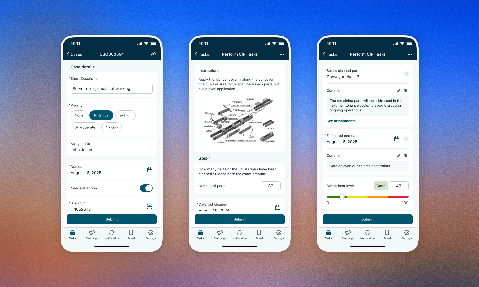
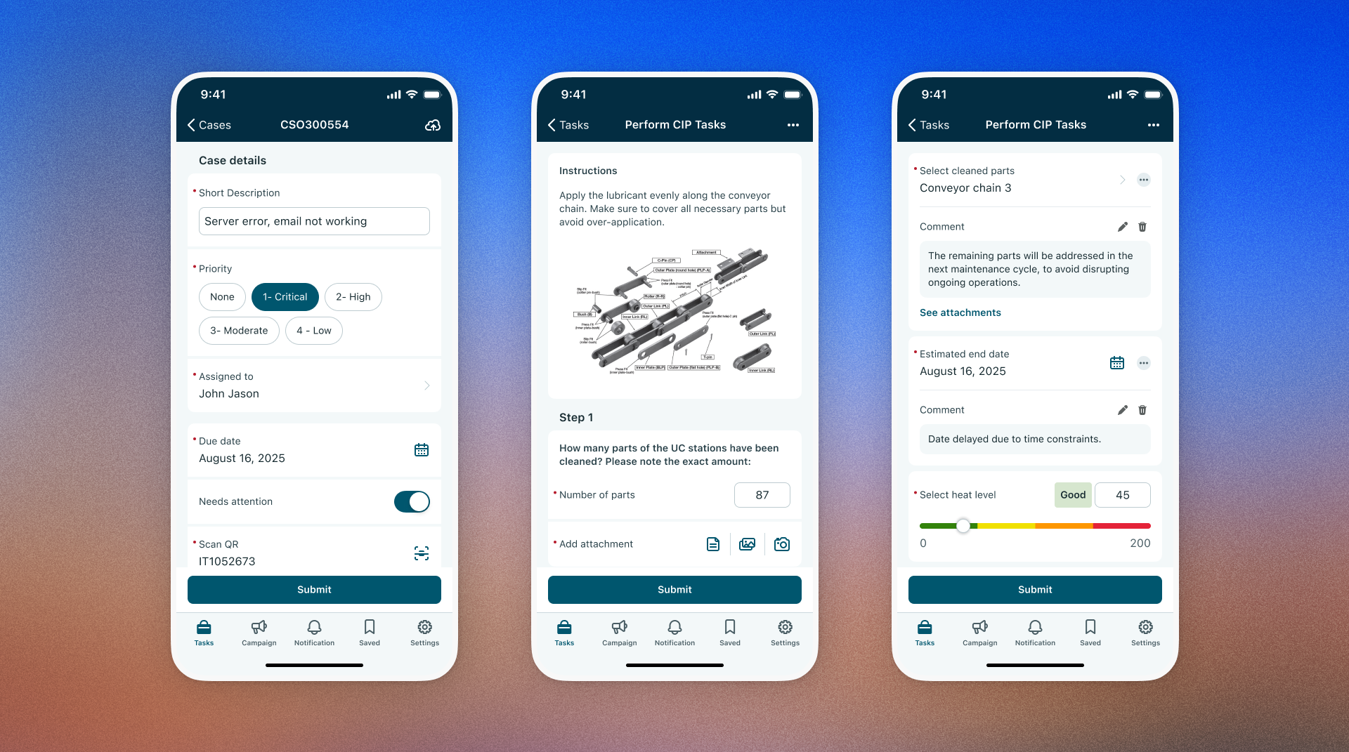
Modernize the UI layout with clearer hierarchy and section organization
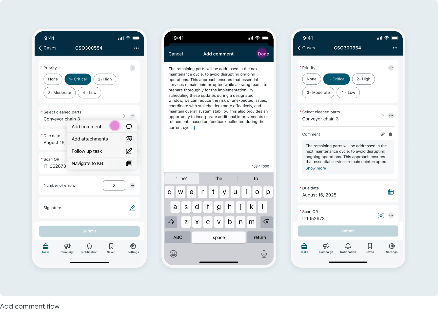
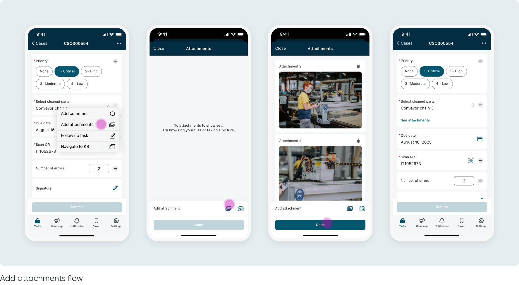
Introduce new inline actions per input: comments, attachments, and navigation to other screens
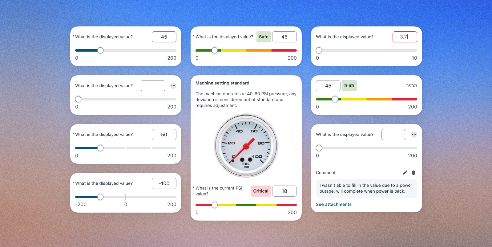
Introduce new input types: descriptive elements and a numeric slider
Reduce the number of taps required to complete a workflow
Give admins greater configuration control over workflow optimization
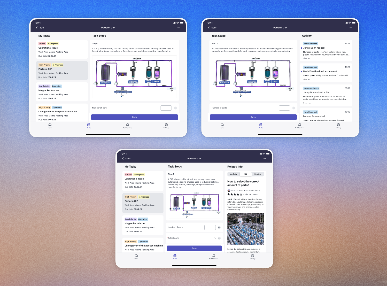
Improve the user experience on Tablet and iPad devices
Given the large scale and fast-paced nature of the project, our research strategy focused on efficiently leveraging existing insights:
4Industry’s approach is built on years of valuable feedback and insights from their legacy products and on-site customer workshops, these contributed to the requirements we received and many of our design decisions
On top of that, our design decisions have been shaped by the backlog we’ve collected over previous releases from various BUs (FSM, EE, and customer requirements)
The team visited Brightspeed's Virginia office, B2C Telco FSM enterprise customer with ~1,800 technicians. A key quote from our mobile PM summed up the stakes:
“The upcoming mobile platform innovations will go a long way toward helping Brightspeed technicians. In particular, enabling inline editing and Improving the UX of inline choice lists literally solved over half of their most critical issues.”
As a platform team, we design a single product that must serve all customers - without knowing exactly who the end user will be. Every design decision needs to be flexible enough for admins to configure it for any persona. This means solutions can't be tailored to one persona; instead they must be configurable by admins to fit any use case.
How we addressed it: Rather than designing for a specific persona, we shifted control to the admin layer while considering the needs to multiple personas. Every new feature - descriptive elements, inline actions, section grouping, slider input - was designed to be fully configurable. Admins can decide what appears, in what order, and how it behaves, allowing the same screen to feel tailored for a factory operator completing a guided task or a field technician resolving an incident.
The 4Industry acquisition introduced a persona, operators are equipment owners working in demanding physical environments - helmets, dirty hands, loud surroundings - often with limited connectivity. They're not tech-savvy, they work in shifts, and they need to complete guided tasks quickly and without confusion.
How we addressed it: We used 4Industry's years of on-site customer workshop insights as a design foundation, and translated the Operator's needs into generic, configurable features - so the same solution could serve them without excluding our existing personas. This included features like descriptive elements for user guidance, inline actions for reduced tapping and improved hierarchy and sectioning for easier perception, as well as considering edge cases of offline mode, ensuring large tappable areas for actions and accessible approach to sliders.
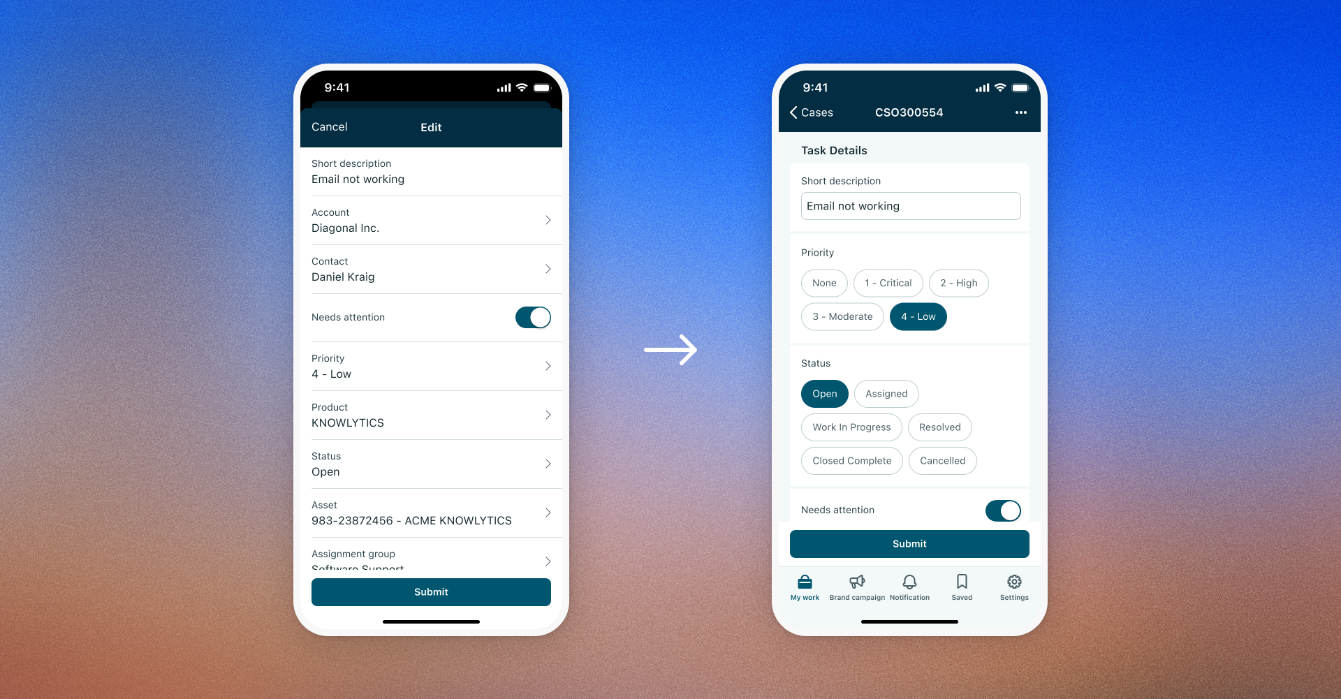
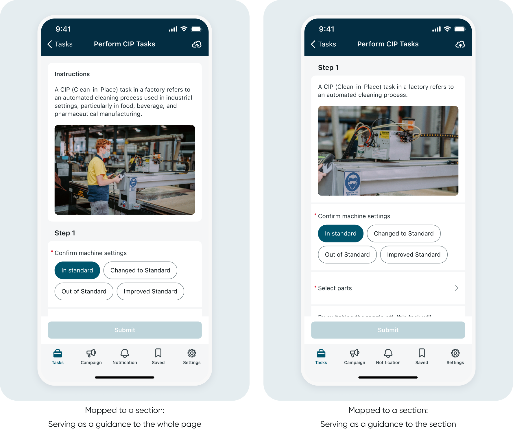
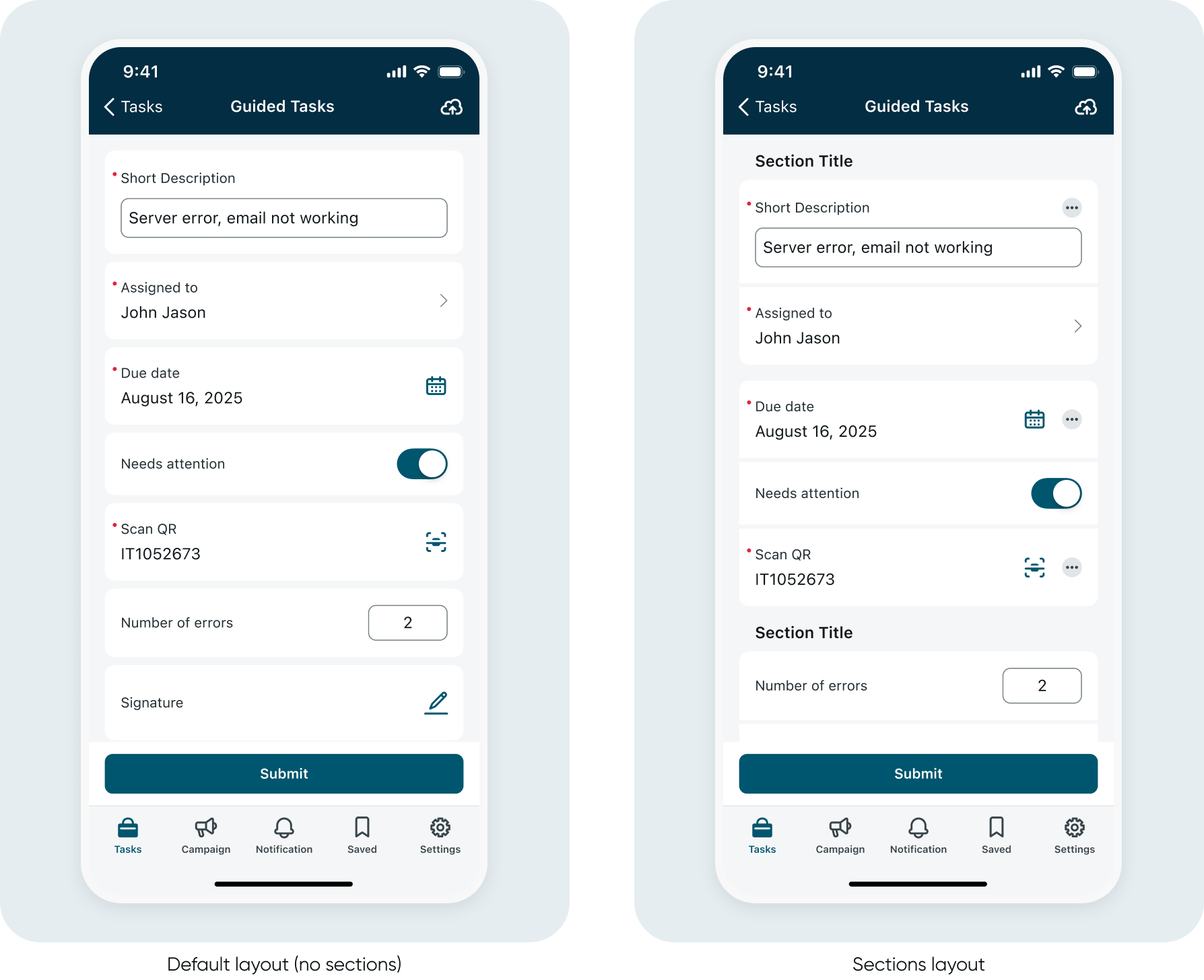
The existing input form had accumulated significant UX debt. The layout was flat, visually undifferentiated, and non-scalable. Users were forced into repetitive back-and-forth navigation just to complete a single form - too many taps, too much disorientation, and no room to grow. On top of that, there was no way to provide contextual guidance inside the form itself. If a user needed instructions or reference material, they had to navigate away entirely - breaking their flow and adding unnecessary friction. This was a hard blocker for 4Industry's Guided Task model, which relies on inline instructions and visual aids.
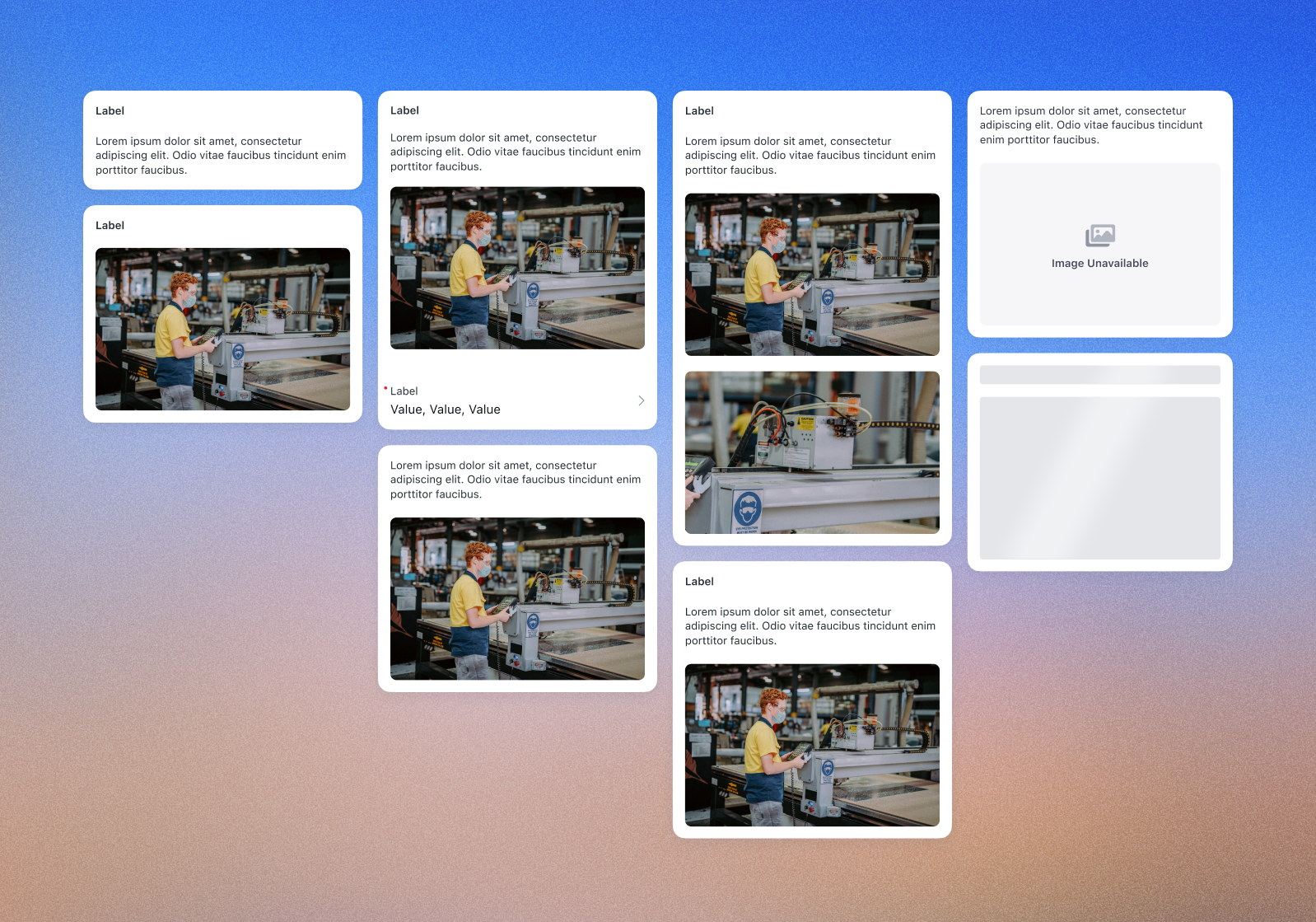
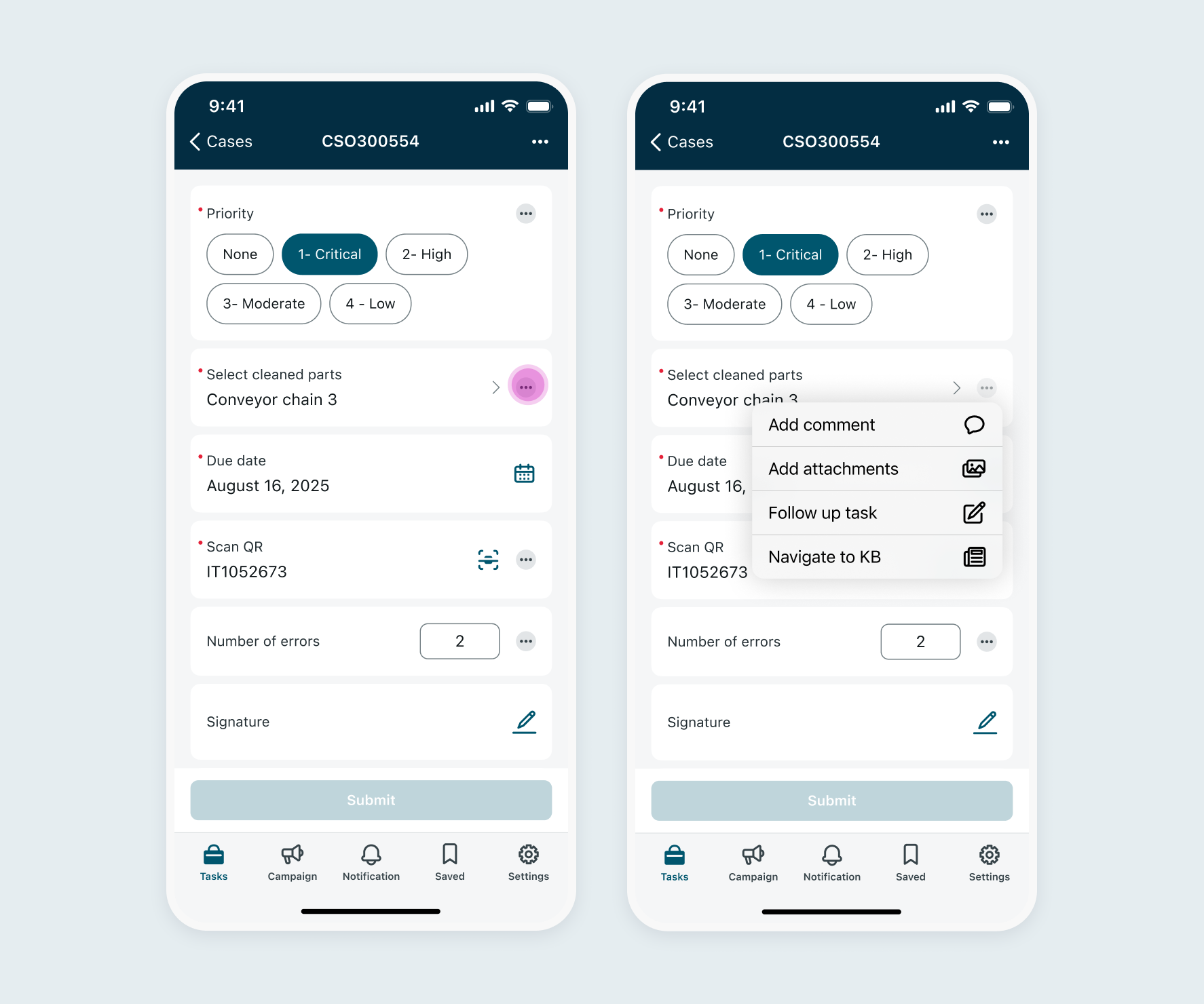
How we addressed it: We introduced a modernized layout with section grouping and clearer visual hierarchy. Inline choice selection, inline actions, and direct navigation from inputs dramatically reduced the number of taps required. We also introduced Descriptive Elements - a new configurable input type supporting a title, description, and image - giving users the context they need right where they need it, without leaving the screen.
The input form simply stretched responsively to fill the tablet screen - no real adaptation, no use of the extra real estate and not consideration for maximum readable width patterns. For users who rely on tablets in the field, this was a missed opportunity to significantly improve their workflow.
How we addressed it: We designed a dedicated tablet split-view layout - full task visibility on one side, with seamless sub-task navigation and a dedicated knowledge base panel on the other. Admins can configure which content appears in split view, making it fully adaptable to different workflows.
A redesigned input form screen - scalable, configurable, and built for every persona.
The redesign shipped as part of the Yokohama release and received strong positive feedback across teams and customers.
• ICW (4Industry) confirmed the new features met their requirements and were very satisfied with the enhancements
• BUs including FSM reported positive responses to the updated experience
• Inline choice lists and descriptive elements directly reduced the number of taps required to complete workflows
• Admins gained significantly more control over workflow configuration, reducing the need for workarounds
• The solution established a scalable foundation for future input types and actions across all personas
-poster-00001.jpg)
Through a thorough analysis of existing route planning apps and user interviews, the research identified that users were looking for more control over their routes and a more personalized approach to route planning.
To achieve this goal, the project had the following objectives:
Design a UI supporting and balancing different types of uses, allowing efficient daily use and full customization.
Provide users with additional data about their routes, improving their experience and giving them more control over their transportation choices.
The process began with a thorough analysis of existing route planning apps (Read more in CA research tab).Then, I conducted user interviews to gain insights into the pain points of the users and the problems of the existing solutions (Read more in Personas & User Flows tab).
The research concluded that most of the existing apps are limited in their ability to customize routes, leaving users with few options to optimize their route according to their preferences.
Daily use:
This is the basic, repetitive use of the app that is intended for everyday usage. It is designed to be efficient and quick, allowing users to quickly access the information they need, such as bus routes, schedules, and arrival times. This type of use is ideal for commuters or people who rely on public transportation on a regular basis, and need a quick way to plan a route.
Advanced use:
This is a more specific and customizable use of the app that allows users to plan and customize their routes. It is intended for users who want to make specific adjustments to their route according to their needs, plan combined routes or explore alternative options. This type of use is ideal for people who want more control over their route planning.
One of the main challenges was designing a user-friendly and intuitive interface that allows advanced route customization.
To solve this challenge, I introduced the route construction interface through a drag and drop function.Drag & drop makes the process of customization more intuitive and user-friendly, as it allows users to visually construct their route, provides users with a sense of control, and enhances the user experience by making the app more interactive and engaging.

Another main challenge was to design an app that caters to both daily uses and advanced uses. The app needs to provide a fast and efficient flow for daily/regular use, and a full customization flow for users who need to create a new route.
One of my approaches to solve this challenge is an initial onboarding stage, where users are asked to set their preferences on certain aspects of route planning. Using this data, the app is able to provide better and more personalized route suggestions, without the need for full customization, resulting in an efficient daily use experience.

The second approach to solve this challenge is the progressive disclosure approach, design that gradually reveals more information and features as needed, in order to prevent users from feeling overwhelmed. This technique can be used to support both novice and expert users, by providing a simple initial interface with advanced options available if needed.
In Yump, when a user searches for a route, they receive top suggested options based on their set preferences, as well as a tabs bar with general filtering options (Best option, fewest transfers, least walking). When a user wishes to further customize their route suggestions, they can select a suggested route and click "Edit". This leads to an advanced editing screen, enables users to easily construct their route by dragging & dropping, and adjusting various options.


One of the pain points I identified in relation to lack of control, is the lack of information provided to users about their routes.By providing users with more information, they can feel more in control of their decisions, and make educated choices when selecting from a few options.Which leads to another challenge - What information should the app provide, and how does it get that data?
Based on my research, I designed a set of features aimed at providing users with more diverse data about the routes.
These features included:
- Social data reports system: Live bus congestion level, Reliability of buses.
- Route live navigation and real-time arrival estimation
Live bus congestion levels
Based on a social report system, encouraging users who got on their bus to send live reports to help others, the app can provide real-time information about how full the bus is at a given time. Information that can help users who dislike very condensed bus environments choose a different route to their destination, or wait for the next bus.
Bus arrival reliability rates
Based on a social report system, encouraging users to send reports if a bus is running late or doesn't arrive at all, the app is able to provide information about how reliable a specific bus line is. Information that can help users choose a route that is more reliable over more efficient, to avoid the chance of the bus not arriving or being late.


that elevates the festival experience, capturing the attention and interest of the participants, while promoting environmental awareness and encouraging better habits, such as recycling and sustainability.
to support the needs of the participants during the festival, enriches their experience, and reinforces the event's eco-friendly approach by reducing printable materials.
To create a memorable experience for kids and their families, I began by developing a compelling theme and storyline for the festival. Drawing inspiration from various online computer games, I created an imaginary narrative centered around the planet of Laksy, together with unique characters I designed to help immerse participants in the story.
As an environmentally-conscious festival, I wanted to ensure that we minimize waste and reduce our ecological footprint as much as possible. With this in mind, I decided to create a mobile app that would serve as the primary point of interaction for participants. By offering features like the ability to purchase food and drinks, access the festival schedule, and get real-time updates on the activities and game progress, we could significantly reduce the need for printed guidance materials and minimize the overall impact. Additionally, I saw an opportunity to create a more immersive experience for the kids, who are often drawn to mobile games and digital interactions. By designing the app with a fun and engaging user interface, with features like points, leaderboard, team progress bar and more, I hoped to enhance their experience and deepen their engagement with the festival.
The main need points the app tackles are:
Onboarding upon arrival and introduction to the festival
Food and drinks purchase
Individual and team game progress tracking
Live guidance through the festival's games
Home page

Leader Board

Login

Onboarding
Food purchase flow

Drinks purchase flow

App Prototype
Festival Posters


Festival snacks & drinks packaging
Made from recyclable ecological plastic and paper.
Festival Flyers


Introduction Cards


Stickers & Visual assets


The existing input form screen had accumulated significant UX debt:
- Users were forced into repetitive back-and-forth navigation to complete a single form, creating disorientation and unnecessary taps.
- The layout was outdated and non-scalable - unable to accommodate new enhancements such as input actions (comments, attachments) and descriptive elements.
- The form was lacking input types and capacilities to improve UX.
- Tablet layouts were entirely underutilized.
At the same time, ServiceNow's acquisition of 4Industry, a Netherlands-based platform for Industrial Connected Workers in manufacturing, introduced a new persona with distinct needs: the Operator. Operators work in demanding physical environments (helmets, dirty hands, loud surroundings), often with limited connectivity, and rely heavily on clear, guided, low-friction interfaces. Bringing 4Industry's customers onto the ServiceNow platform required feature parity - and this was the opportunity to do it right.
The driving goal was to transition 4Industry’s customers over to the ServiceNow platform. To achieve this, our goals were to reach feature parity with 4industry's existing product, but also to redesign and enhance the input form screen as a generic, configurable solution that works across all agent personas - FSM field technicians, ICW operators, Healthcare workers, Retail employees and more.
Specifically:
Created on Webflow
© 2023 by Heli Markman